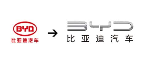
With BYD releasing a new silver-gray brand logo earlier in the year, Geely has also updated its brand logo to gray.
Geely Holding Group today announced a new version of its logo, turning the former blue logo into a starry grey. The new logo brings a new vision that is lighter and has a more technological feel.
Geely said the new logo represents that Geely will meet the future with a more professional posture.
Earlier this year, BYD Auto released a new brand logo, turning the previously used red BYD logo into a more metallic silver-gray color.
The BYD logo means "Build Your Dreams", and the new logo forms the word "BYD" with a dynamic sense of "forward".
In terms of design, BYD's new logo eliminates the oval-shaped border and becomes more open, and opens up the closed space of the three letters of BYD by deforming the letters, so that the end of the line is like an open contact.
It is said that this means that BYD Auto is willing to link with users and partners in a more open posture and explore the new industry of automotive products and services in the intelligent era together.
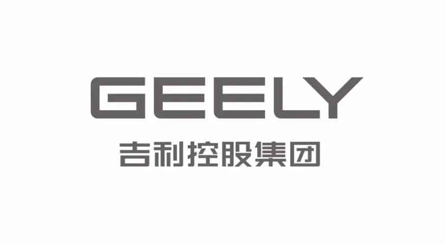
(Geely's new logo)
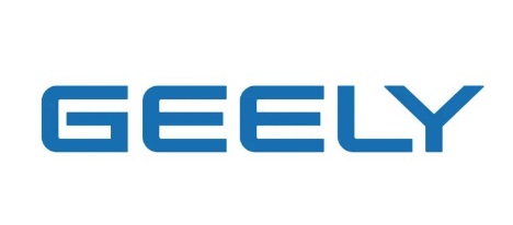
(Geely's old logo)