
Earlier this month, BMW released a new brand LOGO which will be applied to the i4 concept car first. On the evening of March 16, BMW China announced on its official Weibo that the new logo will be fully used in brand communication.
This is also the sixth brand upgrade of BMW in more than 100 years.
Compared with the previous version of the LOGO (launched in 1997), BMW's new LOGO has a flatter shape, without the three-dimensional effect of the previous BMW LOGO.
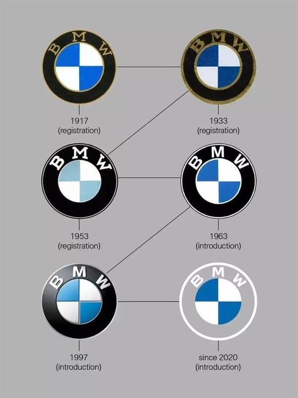
The "BMW" font has changed, and the font has become a transparent design. The black background has been used previously, and the iconic Bavarian "blue sky and white clouds" has been retained.
It is worth noting that this is the first time that the BMW brand has made the brand logo transparent. Since 1917, the black belt around the BMW logo shield has been around.
It can be said that removing this element from the design is a major innovation in historical tradition, and it is also the biggest change in the BMW LOGO for 103 years.
Jens Thiemer, senior vice president of BMW customer brands, said: "Removing the black ring means that BMW is more open and transparent to young car buyers. Digital transformation should also be better achieved, but the exact way is not It's completely clear. After all, the new logo is not three-dimensional in appearance, so this may be related to it. "